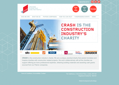
CRASH, the charity that works for the homeless with the construction industry, asked me to make several updates to their site to improve the user experience. The changes were designed to make the site simpler and more intuitive to use. The changes included:
- Adding dropdowns to the main menu
- Changing menu text to make menu items and page titles easier to follow and communicate the work that CRASH does
- Simplifying page layouts including removing unnecessary page elements
- Highlighting the core work that CRASH does
- Emphasising links on the website that CRASH want website visitors to follow
The overall result was a much more streamlined and user friendly site.
Date
July 2017
Client
CRASH
